Thursday, 14 January 2016

Photography test


These are the photos that I took for my photography. I was looking at different ways  or angles that I can take a picture to make it look interesting. The picture that I took that is showing four bins I used the technique framing. The picture below the bin on the left is called symmetry because I focused on the yellow bars which is built like a symmetry. After using different techniques I started getting used to taking pictures and was able to control the focus and the zooming in and out on the camera.

My Experience with the camera at first was hard for me to control mostly when I had to hold the camera straight so the picture that take does not look slanted. If you look at the bottom next to the word "Art Photography" you can see that my camera is not straight so i looks like the pole is bending. For me to get used to the camera I made sure I took enough of pictures and corrected myself picture by picture.  


PHOTOSHOP


After taking the pictures I started using Photoshop. I was trying to experiment with different techniques to make a picture look interesting. As you can see I was trying to make the picture how what is behind the wall. I used a rubber and a blur tool at 40% so that I can make the wall blend in with the other wall. I also learnt how to change the color of the background, this is was useful because it makes the picture have a different shade or tone. I changed the background for the this picture, I made the picture look brighter which made it look like a bright day instead of a dark day (when I took this picture the skies were grey).

What I would have done differently is I could have chosen another picture instead so it can show how clearly what I blended in because now it looks like a picture that I glued to a paper in.


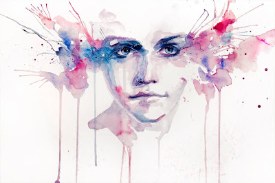
This is my outcome. The first time I used Photoshop it was very challenging because I did not know what type of tools there were, how to use it and where it was. With this experience that I had I was able to see how this could help me with my art  work. I will b able to do Anges Ceceile's work by taking a picture of a person and then adding different effects on Photoshop (for example ink) and layering them which would create a nice effect with all the splashes she does with the watercolour.


Here I was trying to make a composition by removing the person in the corner of the pictrure. I used the magic wand tool which selects the shape in the picture, after that I pres the delete key which removes the selected image from the picture. I was then able to put an image at the back of the image. This then created my composition.

Sunday, 3 January 2016

Artist research 2

Carne Griffiths   
                I found an interesting material that I wanted to use instead of water colour which is oil pastels. I really like this material as it gives it a smooth texture and it blends in with different colours nicely.  I am looking at another artist  and she also uses paint for her work but instead I am using something different for her type of work. As you can see at the left I tried to do the things I wanted to do with the watercolours and it worked. I thought this was more easier than paint because I was able to control the material. I really like this Artist because of the way she presents her own emotions by the medium she uses and I want to be able to do that too.

After seeing his work I really liked the way he does not mix the colours while adding tea to his work. I also understood that he looked at a picture which was full of nature, he then used this image and added it on onto the face he sketched.

The contrast between the two artists that I researched is that Agnes Ceceile after drawing her portrait she adds colours at the side of the face which is abstract but, Carne Griffiths after drawing his portrait he starts sketching what he sees on a picture onto the face. I really like Crane's idea of his work because I can add things on my portrait that does not relate to nature.
I started looking on how the artists create the effects on his piece. For starters I drew my friends face as the artist did in the video and I will then start adding the things that Carne did to make her work look interesting.

If you looked at the YouTube video (link) you can see that he started it of by drawing the face with a pencil and then he gradually added ink. The type of ink that he uses is not just ink that you use for paint he uses ink such as pen which gives a nice thin line when drawing, the colours that he uses makes his work more vibrant. When I started experimenting instead of using a pencil I used a black marker because I was thinking of making the face more visible, I also added a little red on my work. When doing this experiment I did exactly what the Ceceile did which was looking at the picture and drawing the figure or pattern in or out of the face.

I think my experiment worked well as I was able to do the Artist style but doing it a little different by using a marker. I really like the way I drew the lines because it gives a sense of  an emotion as the lines could represent tears. What I would do differently is to use more medium than just two, Ceceile used more than three different techniques to make her piece look interesting.


This is what I did when I started getting used to oil pastel, as you can see it was nice and easy for me to control the way I wanted the colours to be. I used something sharp to scrape some of the oil pastels away as you can see on the image it created a nice thin line which blends in with the other colours. After this experiment I noticed that I am more comfortable with using dry equipment. What I thought really went well in this work is the way I was able to blend colours together, if you look at my other post I did with watercolour you could see that I was not able to blend the colours easily. If I am going further with oil pastels I need to be able to know how to get the right skin tone.


 I was trying out oil pastels on black paper which I thought went well because it made the image look more eye catching mostly with bright colours on the paper. I then used some dusts from a white chalk to create an interesting image. What I should do next is think on how I could use colours to create an emotion for the character.


Artist research

Agnes Cecile


I started experimenting with watercolours as the artist also used watercolours. I tried to look at one of the artist’s work up and looked at the abstract she did with watercolours. I used the same colours she used and as you can see, I tried it out, I thought this was very challenging because I was struggling to get the watercolours the way I wanted it and had no control over it. If you compare her watercolour to mine you could see the big difference. When looking at it I realized that my watercolour experiment looks dry and hers has a more watery effect. I then realized that I should add more water into the paint next time. When using the watercolours, I did not really think it was the right medium for me. After failing the aspect of using watercolours I tried to do the face this time with watercolours. 


I used my sisters face and drew it with a pencil before using watercolours. Doing the face with this medium went well because I was not struggling like I did with the others. The work that I did looked more like Carne Griffith's work because of the lines that I gave on the face, so for my next experiment I will be looking at Carne Griffith's works. I think I should do next is to use a different material, something that is not paint or liquid so I will be able to control the medium.

I started looking at her work and how she was able to mix up her watercolour.


Cellotape, laser print, Biro and hairspray

Please read the writting on the images.


As you can see I used oil pastels and cut out a circled shape to represent the wheels from my old Jeep. I picked the colour; black, yellow, brown and grey because for me these colours brings out the oldness of the car that I have. After getting all the colours I made sure I filled all the area with the colours that I had, as you can see at the bottom of the page (in the image). I then put the circled paper on top of another paper making sure that the coloured area was facing the other paper. Then I drew on the back of the coloured paper making sure that I put enough pressure on the circled paper, when moving the circled paper, it made a nice rough texture on the paper as you can see on the image. I really thought it looked very nice because of the effect it had. when I tried it the second time it created a faded wheel.


Artists I looked at for MyTheme


Sandra Flood


16.00" h x 12.00" w
He used oil painting on linen.


I like his artwork because it shows the persons emotions or feelings. She looks sad, as if she is about to cry. This is a large work which expresses the paintings or the artists feelings.


Louise Price,Painting,Pastels,Animals,On the Rocks


Louise  Price


Painting, Pastels, Animals
11.00" h x 14.00"w


Saatchi Online Artist: Nikos Gyftakis; oil pastel 2005 Painting "Self portrait"

Photo: Saatchi Online Artist: Nikos Gyftakis; oil pastel 2005 Painting "Self portrait"
Categories: Art
Added: 2014-09-09 16:00:33
Tags: Saatchi,Online,Artist:,Nikos,Gyftakis;,oil,pastel,2005,Painting,"Self,portrait"
Resolutions: 601X770
Description: This photo is about Saatchi Online Artist: Nikos Gyftakis; oil pastel 2005 Painting "Self portrait"


Ainhoa Art


Detail of 'The Shock of Colour' 
Oil Pastels 
2007 


Oil Pastels | Eric D. Greene: Artist Tips, Oil Pastel Art, Pastel Eagle, Oil Pastel Techniques, Oil Pastels, Oil Pastel Paintings

Oil Pastels | Eric D. Greene


Roger Derrick


Portrait in Sienna, 2012. Original Oil Painting. 50cms x 40cms

Patrick Palmer

Portrait in Sienna, original oil on canvas, 50 cm x 40 cm, 2012


I like the way they use oil painting as it make it look like a real person, so I researched some artists that did oil painting.

oil painting portrait by yunior hurtado

Yunior Hurtado 
Oil painting


Hongtao- art

Oil painting art-portrait of boy on linen 16*24 inch